
12 ADA Signs for Office Buildings in Los Angeles
ADA signs for office buildings are the cheapest compliance item in a building and the one most often wrong, because the requirements are specific, dimensional, and in California layered two deep. Most buildings have signs on most doors. What they lack is the right sign, at the right height, on the right side of the door, with Braille positioned correctly underneath.
Short answer: Office buildings in Los Angeles answer to both the federal ADA Standards and California Building Code Chapter 11B, and where they differ you meet whichever provides greater accessibility. The practical headline: federal ADA requires one identifying sign per restroom, while California requires two, a geometric symbol on the door and a separate tactile sign on the wall beside it. Permanent rooms, stairwells, exits, elevators, areas of refuge and accessible parking all carry their own requirements. Directional and wayfinding signs do not need Braille.
Two Rulebooks, and California’s Is Stricter
Federal ADA Standards set the national floor. California Building Code Chapter 11B, part of Title 24, sets state requirements that in places exceed it, and where the two differ the owner meets whichever provides greater accessibility.
Restrooms are the clearest example, and the one that catches out-of-state property managers and national tenants. Federal ADA calls for one identifying sign per restroom. California calls for two: the geometric symbol on the door and the tactile identification sign on the adjacent wall. A building that installed only the wall sign satisfies the federal rule and is short a sign in California.
12 ADA Signs for Office Buildings in Los Angeles
- Restroom geometric door symbols. California-specific and widely missed. A quarter-inch-thick equilateral triangle, vertex up, for men. A twelve-inch-diameter circle for women. For all-gender, a circle with a triangle superimposed, its vertices no more than a quarter inch from the circle’s edge. Each must contrast with what it sits on, centered within an inch of the door’s vertical centerline, symbol centerline 58 to 60 inches above the floor.
- Restroom tactile wall signs. The second required restroom sign, on the wall at the latch side. Tactile text with Grade 2 Braille directly below, plus the International Symbol of Accessibility in the pictogram field where the restroom is accessible.
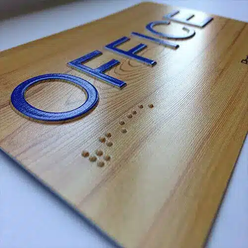
- Permanent room identification. Any space with a permanent function: offices, conference rooms, break rooms, copy rooms, storage, occupant-used utility spaces. The largest category by volume, and the one where buildings substitute decorative nameplates meeting none of the requirements.
- Stairwell floor identification. Tactile characters and Braille on the wall beside the stair at every landing. Easy to skip where stairs are treated as back-of-house.
- Tactile exit signage. Signage identifying exits and exit routes with tactile characters. It sits alongside illuminated exit signs rather than replacing them, since those answer to fire code. Both are required and they are different products.
- Elevator hoistway floor designations. Floor identification on both jambs at every floor, tactile characters and Braille, centerline at 60 inches. Both jambs, not one.
- Elevator cab controls. Braille for every floor button and every control function inside the cab. A retrofit item in older buildings and one an accessibility audit will find immediately.
- Area of refuge signage. Where a building has an area of rescue assistance, it needs signage with the International Symbol of Accessibility identifying the area at its entrance, usually plus directional signage to it.
- Accessible parking stall signs. The International Symbol of Accessibility in white on blue, mounted at a minimum 60 inches, in weather-resistant materials. Van-accessible stalls carry additional designation.
- Parking tow-away warning signage. California requires warning signage at entrances to off-street parking facilities. Content, wording and placement are prescribed, so confirm them against the current code and your jurisdiction rather than copying a sign from another property.
- Accessible entrance identification and directional signs. Where not all entrances are accessible, the accessible ones need identifying and the others need directional signage to the accessible route. A common gap in older buildings with a grand main entrance and a side accessible door.
- Wayfinding and overhead directional signs. Visual rather than tactile, so no Braille, but still governed on character style, size relative to viewing distance, contrast and non-glare finish. Overhead signs need at least 80 inches clearance to their lowest point.
The Dimensions That Get Cited
Four specifications account for most findings, and they are worth knowing because they are measured rather than judged.
Mounting height is measured to character baselines, not the sign. The lowest tactile character’s baseline sits at least 48 inches above the finished floor, the highest no more than 60. A panel centered at 60 inches can still fail if the character layout puts a baseline outside that range.
Placement is on the latch side. Tactile room identification mounts on the latch-side wall, or where there is none, the nearest adjacent wall, preferably the right as you approach. A person must be able to get within three inches of it without meeting a door swing, obstruction or protruding object, which rules out the door itself.
Characters and Braille have their own rules. Raised characters run 5/8 inch to 2 inches, smaller permitted where the sign carries separate visual characters. Braille is Grade 2 contracted with domed dots, directly below the corresponding text or below the whole block on a multi-line sign, separated from other tactile elements by at least 3/8 inch.
Contrast and finish are requirements, not preferences. Light characters on a dark background or dark characters on a light background, with a non-glare finish on characters and their background. California specifies a numerical contrast threshold, which is why a tasteful low-contrast sign that looks right in a lobby can be non-compliant.
Signs You Do Not Need
Worth stating, because over-signing wastes money.
Spaces that are not permanent do not need tactile identification. Open-plan areas, temporary spaces and non-public mechanical spaces generally fall outside the requirement. A conference room needs a sign; a moveable workstation cluster does not.
Directional and wayfinding signage does not require tactile characters or Braille. It still has to meet the visual requirements, but adding Braille to an overhead directional sign serves nobody, since nobody can reach it.
Decorative and branding signage sits outside the requirements entirely, which is why a lobby can carry an elaborate architectural sign or a set of custom plaques with no compliance obligation, provided the required signs exist separately.
Where Buildings Most Often Fail
Five patterns, in rough order of frequency.
The missing California restroom door symbol, in buildings that installed only the wall sign. One sign, two required.
Decorative nameplates standing in for room identification. Brushed metal, engraved, elegant, and lacking raised characters, Braille, contrast and correct mounting.
Signs on the door rather than the wall. Intuitive, and non-compliant, because an opening door takes the sign with it.
Correct signs at incorrect heights. Usually because the installer centered the panel instead of measuring to the character baselines.
Tenant improvements that never got signed. New rooms from a build-out with signage left off the punch list. The most common source of new findings in an otherwise compliant building, and the cheapest to prevent by including signage in the site survey at the start.
Key Takeaways
- Los Angeles office buildings answer to both the federal ADA Standards and California Building Code Chapter 11B, meeting whichever gives greater accessibility.
- California requires two restroom signs, a geometric door symbol and a tactile wall sign, where federal ADA requires one.
- Restroom door symbols are a triangle for men, a 12-inch circle for women, and a circle with superimposed triangle for all-gender, centerline 58 to 60 inches.
- Mounting height is measured to character baselines: lowest at 48 inches minimum, highest at 60 inches maximum.
- Tactile room signs mount on the latch-side wall, never on the door, with three inches of reach clearance.
- Raised characters run 5/8 to 2 inches, with Grade 2 Braille directly below and 3/8 inch separation from other tactile elements.
- Stairwell landings, both elevator jambs on every floor, elevator cab controls and areas of refuge all need tactile signage.
- Directional and wayfinding signs need no Braille, and open-plan, temporary and non-public mechanical spaces need no room identification.
Frequently Asked Questions
Can an ADA sign go on the door instead of the wall?
No, for tactile room identification. It mounts on the wall at the latch side so a person can reach it without the door moving, and the requirement includes being able to get within three inches of it without meeting a door swing or obstruction. The one sign that does go on the door is California’s restroom geometric symbol, which is a separate requirement from the tactile wall sign rather than an alternative to it.
Do conference rooms and offices need Braille signs?
Yes, if the space has a permanent function, which offices and conference rooms do. Tactile identification with Grade 2 Braille is required. What does not require it is a space that is not permanent, such as an open-plan work area or a temporary room. Replacing a decorative nameplate with a compliant sign is usually the single largest line item in bringing an older building up to standard.
Does California really require two restroom signs?
Yes. The geometric symbol goes on the door and the tactile identification sign goes on the wall beside it, and both are required. Federal ADA asks for one identifying sign, so a building that complied with the federal rule alone is short a sign in California. This is the most common finding in buildings managed from outside the state.
Are illuminated exit signs enough, or do I need tactile exit signs too?
Both. Illuminated exit signs answer to fire and building code for egress. Tactile exit and exit-route signage is an accessibility requirement and a different product. Having one does not satisfy the other, and buildings frequently have the illuminated signs and not the tactile ones.
How do I find out what my building is missing?
A walkthrough against the requirements, room by room, checking presence first and then mounting height, side of door, contrast and Braille position. Measure to character baselines rather than the panel. For a larger building or a portfolio, a documented survey is worth having, both to scope the work and to show good faith if a complaint arrives.
Getting ADA Signs for Office Buildings Right
ADA signs for office buildings are inexpensive individually and add up across a floor plate, which is why they get specified casually and fail on dimensions. The items that catch buildings are consistent: the missing California door symbol, decorative plates doing a compliance job, signs on doors, and heights measured to the wrong reference.
Los Angeles Sign Company manufactures and installs ADA tactile signage across LA, along with the design and fabrication behind a building-wide program. If you are scoping a tenant improvement or working from an accessibility finding, request a quote with the floor plan rather than a sign count, since the plan is what determines the schedule.
One caveat worth stating: the figures here reflect published summaries of the ADA Standards and CBC Chapter 11B, and codes are amended. Confirm specifics against the current code text and your local building department or the Division of the State Architect before a building-wide install.
