
Channel letter sign styles are usually presented as one product with a color choice, which is why so many storefronts end up with a sign that is technically correct and completely generic. Construction changes the look far more than color does, and three of these change it without touching the lighting at all.
Here are ten, what each is, and what LA conditions and landlords do to the decision.
Short answer: Channel letters are individually fabricated three-dimensional letters, typically aluminum returns 3 to 8 inches deep with 5 inches most common, lit internally by LEDs. The main styles are front-lit, reverse or halo-lit, combination, open-face, trimless and non-illuminated. Three more options are about how the letters attach, raceway, wireway or flush mount, and they affect appearance as much as any lighting choice. Your landlord’s tenant criteria often decides that part before you do.
What Makes a Channel Letter a Channel Letter
Each letter is its own fabricated can. The sides are returns, usually aluminum around .040 inch coil. The front is a face, commonly 3/16 inch cast acrylic, and on standard construction a trim cap bonds face to return in a 3/4, 1 or 2 inch width. LEDs sit inside. Depth runs 3 to 8 inches, with 5 the common choice, and that is not purely aesthetic: depth affects how evenly the face lights, and lease projection limits often cap it before you decide.
Illumination and Construction Styles
- Front-lit. The default. A translucent acrylic face glows evenly so letters read from a distance, which makes it right for street-facing retail, franchises and food service, and for brands where the exact corporate color has to be matched.
- Reverse-lit, also called halo-lit. An opaque face with an open back, on standoffs usually 1 to 1.5 inches off the wall. Light washes backward so the letter reads as a dark silhouette in a glow with no visible light source. The most upmarket illuminated option, with one hard requirement: the wall becomes part of the sign, so it only works on a clean flat surface. Standoff projection is another thing landlords limit.
- Combination lit. Front-lit and halo-lit in the same letter, so the face glows and the wall glows behind it. The most visible option at night and the most expensive to power, which makes it a feature choice rather than a default.
- Open-face. No face at all. A glass neon or LED neon tube sits inside the channel and stays visible, with the returns framing it and casting a shadow. Lit, you see the tube; unlit, the metal shell still carries the brand in daylight. It suits bars, barbershops, tattoo studios and specialty cafes, fits corporate brand standards poorly, and some landlords object to exposed tube outright. If the tube is the look you want, neon signage may be the better conversation.
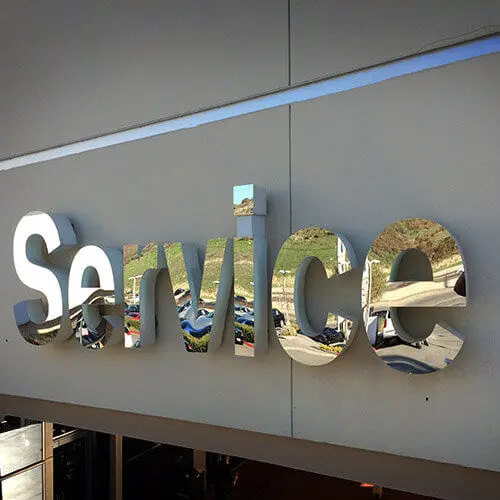
- Trimless front-lit. No visible trim cap, achieved with an internal lip in the return so the acrylic sits flush and the letter reads as one seamless form. Unlit, a standard front-lit letter looks assembled and a trimless one looks machined. It is the most expensive style, needs tight tolerances, works best roughly 6 to 28 inches tall, and above about 48 inches should not be specified without added structural support. Fashion and luxury brands drive most of the demand.
- Non-illuminated dimensional letters. Depth with no lighting. Cheaper, no electrical, no power supplies to fail. The tradeoff is that the sign stops working after dark, so it belongs where ambient light is good or hours are daytime. Often done in fabricated metal for the material quality.
- Letters on a backer panel. The set mounts to a decorative panel rather than the building, giving the sign a defined field, hiding wall irregularity and reading as one unit. It is the practical answer on brick, stucco or any surface you would rather not perforate repeatedly, and a common way to carry a shaped logo can alongside the letters.
Mounting Styles That Change the Look
These last three are about how letters attach rather than how they light, and buyers conflate them with styles constantly. They are visible from the street, and your landlord may have already decided for you.
- Raceway mounted. Letters attach to an enclosed aluminum box housing the power supplies and wiring, roughly 4.5 to 7 inches deep. One wall penetration, everything serviceable from the raceway, and the box visible as a horizontal band behind the letters, paintable to match the wall. Many landlords require it because it means a single hole in their building.
- Flush or direct mount. Each letter fastened individually with wiring routed through the wall. The cleanest look available, letters floating on the facade with nothing behind them, and the most penetrations, which is exactly why some landlords refuse it.
- Wireway mounted. A slimmer enclosure around 2 inches deep that carries the wiring but not the power supplies. Lower profile than a raceway, so it reads closer to flush mount, with the tradeoff that it is harder to service. Some landlords ban raceways for smaller tenants and require this instead.
Landlord policies genuinely conflict, so read the tenant criteria before the design is final. Mounting also interacts with sign engineering once letters get large, since attachment and structural support stop being separate questions.
The UL Question Most Buyers Never Ask
This one is worth more than any style decision, because it determines whether your sign is legal to install.
UL 48 covers the assembled electric sign, while separate standards cover components, including UL 879 and UL 2161 for neon transformers and power supplies. NEC Article 600.3 requires an electric sign to be listed and installed according to that listing.
Here is the part that catches people. A sign built entirely from UL-recognized components is not automatically a UL Listed sign. Only a fabricator enrolled in a UL program may apply the listed mark to the finished assembly. A quote mentioning UL components is not a quote for a listed sign, and the distinction surfaces at inspection rather than purchase.
Ask directly which one you are buying. Any legitimate sign manufacturer will answer in one sentence, and it is the cleanest way to separate a fabricator from a reseller.
What Los Angeles Does to Channel Letters
Three local factors change how these styles hold up.
Sun is the first. UV degrades acrylic faces and applied vinyl overlays over time, and the fade shows worst on saturated brand colors, especially reds, on south and west-facing elevations. How color is achieved, pigmented acrylic versus applied translucent vinyl, affects how the sign looks in year five rather than year one.
Heat is the second and less obvious. LED power supplies are the shortest-lived electrical component in an illuminated sign, and heat shortens them further. A raceway concentrates them in one enclosure, which is both a service advantage and a thermal consideration worth asking about.
Regulation is the third. Illuminated signage needs a permit, requirements vary by zone and sign district, and historic and landmark properties often restrict illumination further. Settle that through sign permitting before fabrication rather than during it.
Choosing Among Channel Letter Sign Styles
- Read the tenant criteria first. It may dictate mounting method, depth, projection and whether illumination is allowed at all.
- Match style to viewing distance and speed. Front-lit for moving traffic, halo for a facade people approach on foot.
- Check the wall before specifying halo. Reverse-lit on an uneven or stained wall projects every flaw.
- Budget by style. Trimless and combination are premium, non-illuminated entry, standard front-lit the volume choice.
- Confirm UL Listed on the assembly, not UL components.
- Specify how the color is achieved, because pigmented acrylic and applied vinyl age differently in LA sun.
Key Takeaways
- Channel letters are individually fabricated cans, typically .040 inch aluminum returns with 3/16 inch acrylic faces, 3 to 8 inches deep and most often 5.
- Front-lit is the readable default, and halo the premium look, but halo requires a clean flat wall.
- Trimless looks machined rather than assembled, suits 6 to 28 inch letters, and needs added support above about 48 inches.
- Open-face with visible neon or LED tube suits character-driven businesses and conflicts with corporate brand standards.
- Raceway, wireway and flush mount are mounting choices that change appearance as much as lighting does.
- Landlord tenant criteria frequently decides mounting, depth and projection before the buyer does.
- A sign made from UL-recognized components is not a UL Listed sign. Only an enrolled fabricator can list the assembly.
- LA sun degrades acrylic and vinyl, and heat shortens LED power supply life, the first component to fail.
Frequently Asked Questions
What is the difference between front-lit and halo-lit channel letters?
Front-lit letters have a translucent acrylic face that glows, so the letterform is bright and reads from a distance. Halo-lit letters have an opaque face and open back on standoffs, so light washes the wall behind and the letter appears as a silhouette inside a glow. Front-lit is more legible at speed. Halo is more refined up close and depends on a clean flat wall.
How deep should channel letters be?
Between 3 and 8 inches, with 5 inches the most common. Deeper letters light more evenly because the LEDs sit further from the face, so depth is a performance decision rather than only a visual one. Lease projection limits and tenant criteria often set a maximum before you choose.
Does my landlord decide the mounting method?
Frequently, yes, and policies conflict between buildings. Some landlords require a raceway because it means one wall penetration. Others ban raceways for smaller tenants and require a slimmer wireway. Flush mount gives the cleanest appearance and the most penetrations, which is why it is the one most often refused. Get the tenant criteria before design, not after.
Are LED channel letters better than neon?
For front-lit letters, LEDs are the standard now on efficiency, lifespan and serviceability. Neon still wins where the tube itself is the design, which is open-face construction, because exposed glass neon has a quality of light and a look that LED imitations do not fully reproduce. The honest answer depends on whether you want a lit letter or a visible tube.
Can channel letters be non-illuminated?
Yes, and it is a legitimate choice rather than a downgrade. Fabricated dimensional letters give depth and material quality with no electrical work, no power supplies to replace and no illumination to permit. The limitation is straightforward: the sign stops communicating after dark, so it fits daytime businesses or facades with strong ambient light.
Specifying Channel Letter Sign Styles in Los Angeles
Across these channel letter sign styles the expensive mistakes are consistent, and none are about color: specifying halo for a wall that cannot carry it, discovering a mounting restriction after design approval, buying UL components and expecting a listed sign, or choosing a color method that fades on a west-facing elevation.
Los Angeles Sign Company designs, manufactures and installs backlit signs and letters and full storefront signage across LA, and handles the permitting and engineering alongside the fabrication. If you have tenant criteria in hand or a facade you are trying to work out, request a quote and bring the lease requirements to the first conversation.
