
8 Storefront Sign Types for Los Angeles Retail
Choosing a storefront sign gets treated as an aesthetic decision, and the aesthetics are the last part of it. What actually narrows the field is how customers arrive, how far away they read the sign from, what the building will structurally accept, what the landlord’s criteria allow, and what the jurisdiction will permit. Get those right and the visual choice becomes straightforward. Get them wrong and you have a beautiful sign that cannot be installed. Here are the eight types most Los Angeles retail businesses actually use, and where each belongs.
SHORT ANSWER
Front-lit channel letters are the default for most retail storefronts. Halo-lit letters suit upscale and modern branding. Cabinet signs are the economical choice and the easiest to change for tenant turnover. Dimensional non-illuminated letters work where lighting is unnecessary or restricted. Blade signs serve walkable districts. Awning signage adds shade and branding together. Window graphics are inexpensive and often lightly regulated. Neon remains unmatched where its specific look is the point.
1. Front-Lit Channel Letters
Individually fabricated letters with translucent faces and internal illumination, mounted directly to the building or on a raceway. This is the most common permanent retail storefront sign, and for good reason: strong daytime presence, strong night visibility, and a professional look that scales from a small shop to a national brand.
They work almost anywhere with adequate facade area. The considerations are electrical supply, mounting method, and whether your landlord or center criteria permit raceway mounting or require direct mount with concealed wiring.
2. Halo-Lit Channel Letters
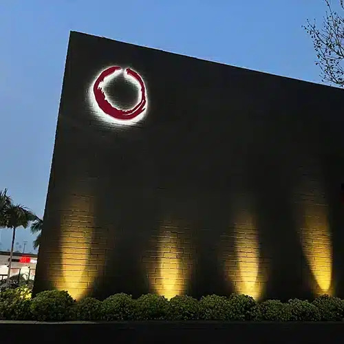
Also called reverse channel or backlit letters. The face is opaque, usually metal, and light projects backward onto the wall behind, producing a glowing outline around each letter.
The effect reads as more refined than front-lit, which is why it suits upscale retail, restaurants, professional offices, and modern architecture. It needs a suitable wall surface behind it to reflect against, and it performs best where the background is light enough to show the halo. Backlit signs and letters generally cost more than front-lit for the same copy, and they photograph beautifully, which matters for businesses whose customers find them through images.
3. Cabinet Signs
A fabricated box with a translucent face, internally illuminated, with the graphics printed or applied to the face.
The advantages are cost and flexibility. A cabinet costs less than individual letters covering the same area, and when a tenant changes or a brand updates, only the face is replaced rather than the whole sign. That makes them common in strip centers and multi-tenant buildings.
The tradeoff is appearance. A cabinet reads as a single rectangle rather than as individual letters, which some brands want and others avoid. Face material also matters in Southern California, where sustained ultraviolet exposure fades printed faces over time.
4. Dimensional Non-Illuminated Letters
Solid letters in metal, acrylic, or composite, mounted to the facade without internal lighting. Illumination, if any, comes from external fixtures.
These suit situations where lighting is unnecessary because the business operates in daylight hours, where the architecture calls for restraint, or where a historic district or design overlay restricts illumination. They also tend to be the most durable option, since there is no electrical component to fail. Architectural signage frequently falls into this category, particularly on office and mixed-use buildings.
5. Blade and Projecting Signs
Mounted perpendicular to the building so they are visible to people walking along the sidewalk rather than only to those directly in front.
These are the right answer in walkable districts, where a flush-mounted sign is invisible until a pedestrian is already past the door. They work particularly well for businesses in a row of similar storefronts.
The complication is regulatory. A sign projecting over a public sidewalk raises right-of-way questions in addition to standard sign permitting, and allowable projection, height, and clearance are all governed. Confirm the specifics for your address through sign permitting before designing one.
6. Awning Signage
Lettering or graphics applied to a fabric or metal awning, which provides shade and signage in one element.
In Southern California the shade is not incidental. An awning reduces solar gain on the storefront, protects merchandise from sun exposure through the glass, and makes the entry more comfortable. The signage is effectively a bonus on an element you might want anyway.
The awning itself is typically a permitted structure, and the lettering on it is regulated as signage, so both aspects need addressing. Fabric also weathers, and in full sun it will need replacing before a metal sign would.
7. Window Graphics
Cut vinyl lettering, printed graphics, frosted film, or perforated window film that is visible from outside while allowing visibility from within.
This is the least expensive permanent-ish signage available, it is quick to produce and install, and in many jurisdictions window signage below a percentage of window area falls outside permit requirements. That combination makes it useful for hours, services, phone-free branding, and promotions.
Treat the exemption carefully. Thresholds vary by jurisdiction, and exceeding them turns exempt signage into a violation. Vinyl also fades in direct sun, so south and west facing glass will need refreshing sooner.
8. Neon
Genuine glass tube neon, which Los Angeles has more of, and more affection for, than most cities.
LED approximates neon and does not match it. The light quality, the depth of color, and the way it reads at night are specific to the medium, which is why businesses whose identity depends on that look continue to specify it. Neon signage also carries a heritage association in this city that a manufactured alternative does not.
It requires skilled fabrication and periodic service, and on historic buildings original neon may be subject to preservation considerations, which can make restoration the preferred route over replacement.
Also Worth Considering
Monument and freestanding signs suit properties set back from the street with parking in front, where a building-mounted sign is too far from passing traffic to read. They involve foundations and structural review, which makes them a larger project than facade signage.
Electronic displays are a category of their own, with content that changes and regulation that is considerably tighter than for static signage across Los Angeles County.
How to Choose a Storefront Sign Type
- How do customers arrive? Walking favors blade signs and window graphics. Driving favors larger channel letters or a monument sign.
- What is the reading distance? Letter height follows viewing distance, and a sign sized for the sidewalk is illegible from a boulevard.
- Do you need night visibility? Evening hours make illumination close to mandatory. Daytime-only businesses have more freedom.
- What does the facade allow? Available area, mounting surface, and electrical access all constrain the options.
- What do the landlord and center criteria require? Many retail centers have signage standards stricter than the city’s.
- What will the jurisdiction permit? Zoning, overlays, and historic district status can eliminate options entirely.
What Affects Cost More Than the Type
Two quotes for the same sign type can differ substantially, and the type is rarely the reason.
Size drives material and fabrication. Illumination adds electrical work and, on a retrofit, possibly a new circuit. Mounting method matters, since direct mount with concealed wiring costs more than a raceway. Installation access, whether a lift is needed and whether the work happens over a sidewalk, affects labor. Permitting and any required structural review carry their own cost and schedule. And finish quality, particularly for outdoor exposure in this climate, separates a sign that looks good in year five from one that does not.
When comparing proposals, match those items before comparing the numbers.
Key Takeaways
- Front-lit channel letters are the default for most retail storefronts.
- Halo-lit letters need a suitable wall behind them to produce the effect.
- Cabinet signs cost less and simplify tenant changeover since only the face is replaced.
- Non-illuminated dimensional letters suit design overlays and historic areas that restrict lighting.
- Blade signs serve walkable districts and involve public right-of-way considerations.
- Awnings deliver shade and signage together, which matters in Southern California sun.
- Window graphics are often exempt below a percentage threshold, which varies by jurisdiction.
- Neon has a look LED approximates rather than matches.
Frequently Asked Questions
Which storefront sign type is most cost effective?
Window graphics for the lowest cost, and cabinet signs for the best value in permanent illuminated signage covering a given area. Channel letters cost more and generally present better, which is why most retail brands accept the difference.
How big should my sign letters be?
Letter height follows viewing distance, so a sign read from a passing car needs substantially larger letters than one read from the sidewalk. Local sign area limits, which are often tied to building frontage, set the ceiling.
Can I have more than one type of sign?
Usually, within the total sign area your jurisdiction allows. Many storefronts combine channel letters on the facade with a blade sign and window graphics, which serves drivers and pedestrians differently.
Do all of these require permits?
Most permanent exterior signs do, and illuminated signs generally involve electrical review as well. Window signage below a threshold is sometimes exempt, though the threshold varies by jurisdiction.
How long does a storefront sign last?
Well-built illuminated signage lasts many years with component service along the way. Sun exposure is the main limiting factor here, affecting acrylic faces, vinyl, and printed graphics more than metal.
Can I reuse the previous tenant’s sign?
Sometimes, particularly with a cabinet sign where the face can be replaced. Verify whether the existing installation was permitted before proceeding, since refacing can bring the whole sign under review.
Conclusion
The right storefront sign type follows from how your customers reach you, how far away they read it from, and what your building and jurisdiction will accept. Most Los Angeles retail lands on channel letters for good reason, though a blade sign in a walkable district or an awning on a sun-exposed frontage often does more work for the money. Establish the constraints first and the visual decision gets much easier.
Los Angeles Sign Company designs, permits, fabricates, and installs storefront signage for businesses across Los Angeles, Orange County, Ventura County, Riverside County, and San Bernardino County. If you are planning signage for a new location or replacing what is there, reach out today for a free consultation.
